Used words
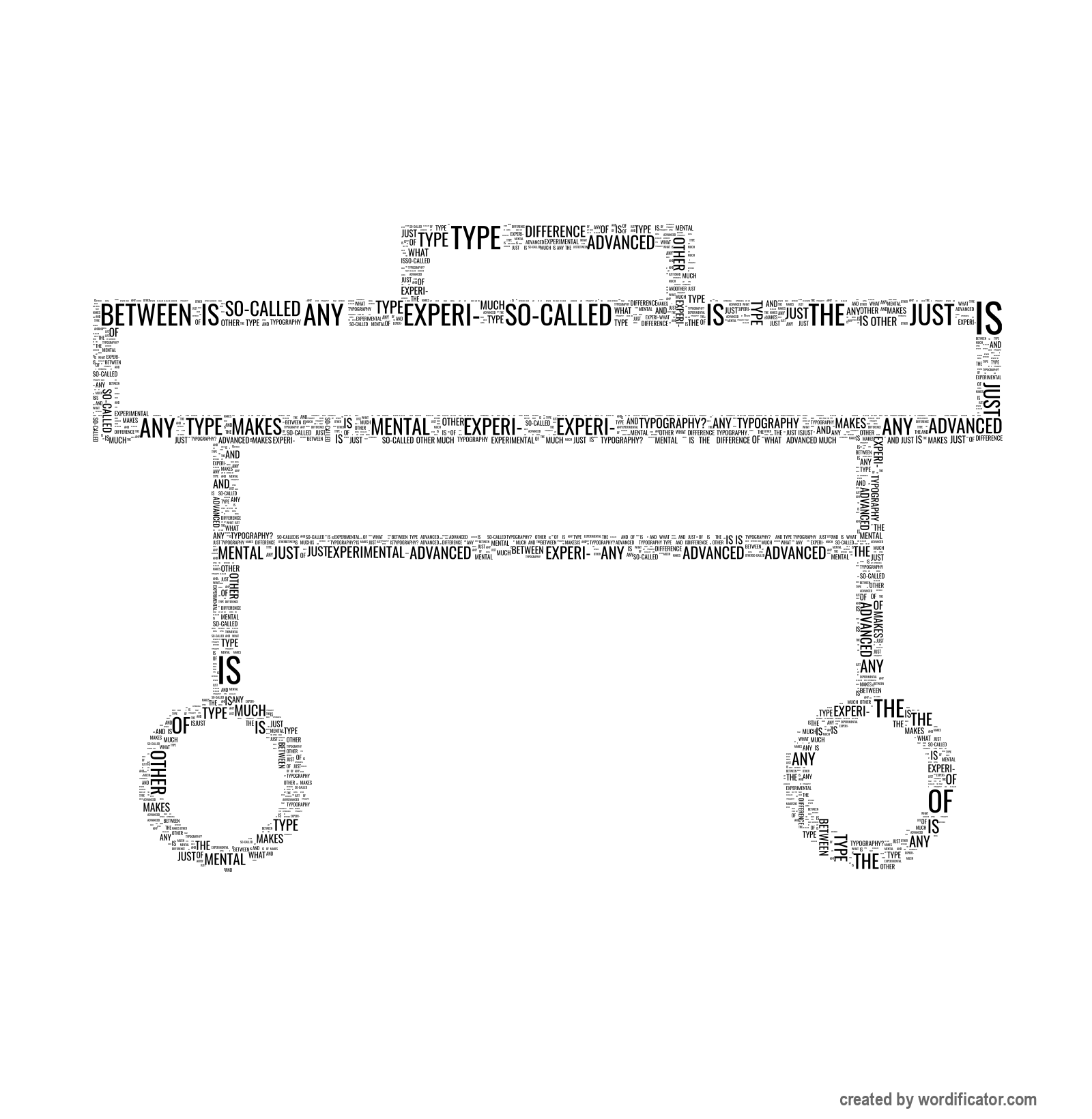
What
makes
the
difference
between
experimental
typography
and
any
other
type
of
advanced
typography?
Much
so-called
experi-
mental
is
just
another
form
exercise
within
frame-work
a
certain
modern
trend
only
some
these
experiments
are
funda-
create
basic
discussion
on
typography.
For
sake
well
understanding
it
should
be
wise
to
draw
dividing
lines.
The
real
in
started
at
beginning
this
century
they
came
with
futurism
dadaism
constructivism.
At
time
idea
integration
context
was
expressed
very
clear
way.
It
when
writers
poets
tried
‘shape’
their
texts
order
express
themselves
more
clearly.
Among
earliest
(already
around
1897)
Stephane
Mallarme
his
book
‘Un
coup
de
des’
break
up
regular
typographical
sentences
shorter
groups
words
bring
space
into
page.
new
typographic
movement
did
not
start
its
own
1910
whole
cultural
scene
changed
through
series
important
moments
field
arts.
Typography
printed
word
one
most
functional
vehicles
for
ideas
therefore
always
reflection
general
pattern.
Before
century
however
never
became
an
independent
art
itself
we
may
possibly
say
that
what
call
‘experimental
typography’
without
primary
function
making
text
readable.
Experimental
are
point
opponents
each
other.
reflecting
pattern
but
gives
primarily
self-reflection.
As
soon
as
carry
out
improve
solution
means
do
research
cannot
speak
typography
results
solution
problem.
Thus
good
understanding
have
divide
from
research
first
leads
way
completely
uncontrollable
unknown
results
second
carried
achieve
better
given
Therefore
true
carrier
written
ideas
original
meaning
word
typogra-
phy
art
pure
expression.
closely
related
now
‘concrete
poetry’.
If
look
work
painters
designers
period
great
revolutions
1910-1920
can
clearly
experiments.
example
works
Apollinaire
Marinetti
Tzara
Schwitters
Van
Doesburg
mainly
futurists
dadaists
belong
interpretation
El
Lissitzky
Rodchenko
later
Piet
Zwart
Jan
Tschichold
Herbert
Bayer
interpretation.
These
two
basically
different
directions
exist
until
today.
A
major
part
concrete
poetry
still
typography
example
‘Experimenta
Typographica’
Wil
Sandberg
visual
John
Cage
Dieter
Rot
and
extent
also
‘scripts’
Hannah
Darboven.
On
hand
much
larger
group
solutions.
Most
striking
been
Karl
Gerstner
who
introduced
anamorphose
wrote
elementary
literature
Brian
Coe
eliminated
parts
letters
arrive
view
legibility
problems
den
Bergh
‘capital-twin-typography’
help
coloured
spectacles
save
paper.
Possibly
alphabet
Epps
Evans
machine
recognition
my
own
experiment
CRT
reproduction
noted.
More
recent
Wolfgang
Weingart
editor
issue
Helmut
Schmid
both
almost
two
interpretations.
Their
partly
problem-solving
close
self-expression.
Of
course
sometimes
difficult
distinguish
experiments
quite
normal
because
nature
field.
There
natural
vice-versa
influence
visualized
discovered.
We
discover
something
individual
expression
while
fundamental
could
lead
unex-
pected
grade
even
same
active
both
sides
line.
point
I
would
like
attention
fact
seldom
or
never
aware
findings
research.
By
sheer
intuition
often
reach
conclusions
valid
types
scientific
hand
designer
awareness
appreciation
contemporary
atmosphere
inclined
use
overstatement
emphasize
findings.
In
opinion
case
many
influential
pieces
design.
Often
design
aiming
improving
comprehensibility
overshadowed
by
expressive
overstatement.
But
if
element
exaggeration
had
existed
piece
drawn
so
fulfilled
pioneering
role.
vicious
circle.
Anyhow
there
need
overstatement
self-expression
needs
future
development.
However
clarity
optimal
think
must
try
expression
Create your own

Share your Artwork


