Tips & Tricks - words into shape generator
Creating beautiful word art is easy, but with a few smart techniques you can take your designs from just nice to truly impressive. Here are some practical tips and creative ideas to help you get the best results from Wordificator.
Most important: Use a well balanced mix of words
Wordificator works best when your word list contains a mix of long and short words. Short words help fill tight corners, while long words create structure and visual anchors.
If your shape has empty spots, try adding a few extra short words like “love”, “joy”, “art”, “fun”, or initials.
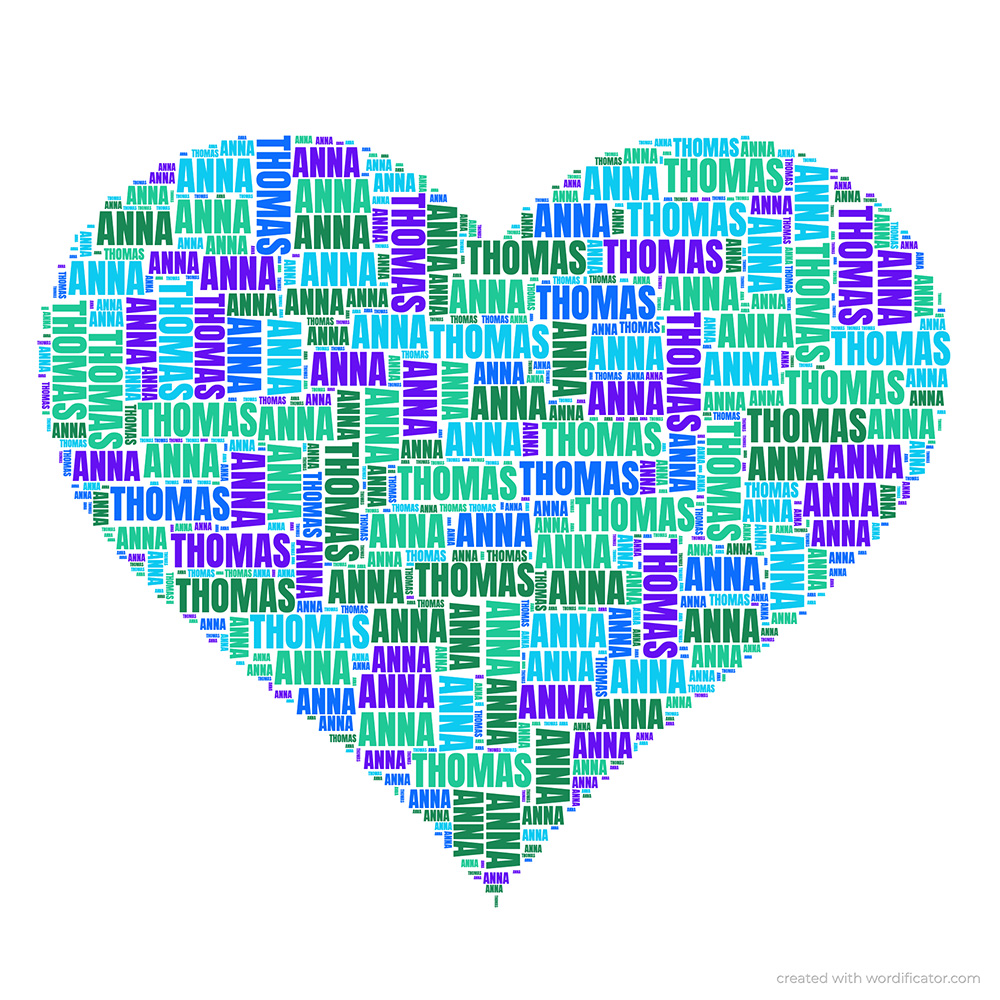
Use an asterisk (*) to boost word size
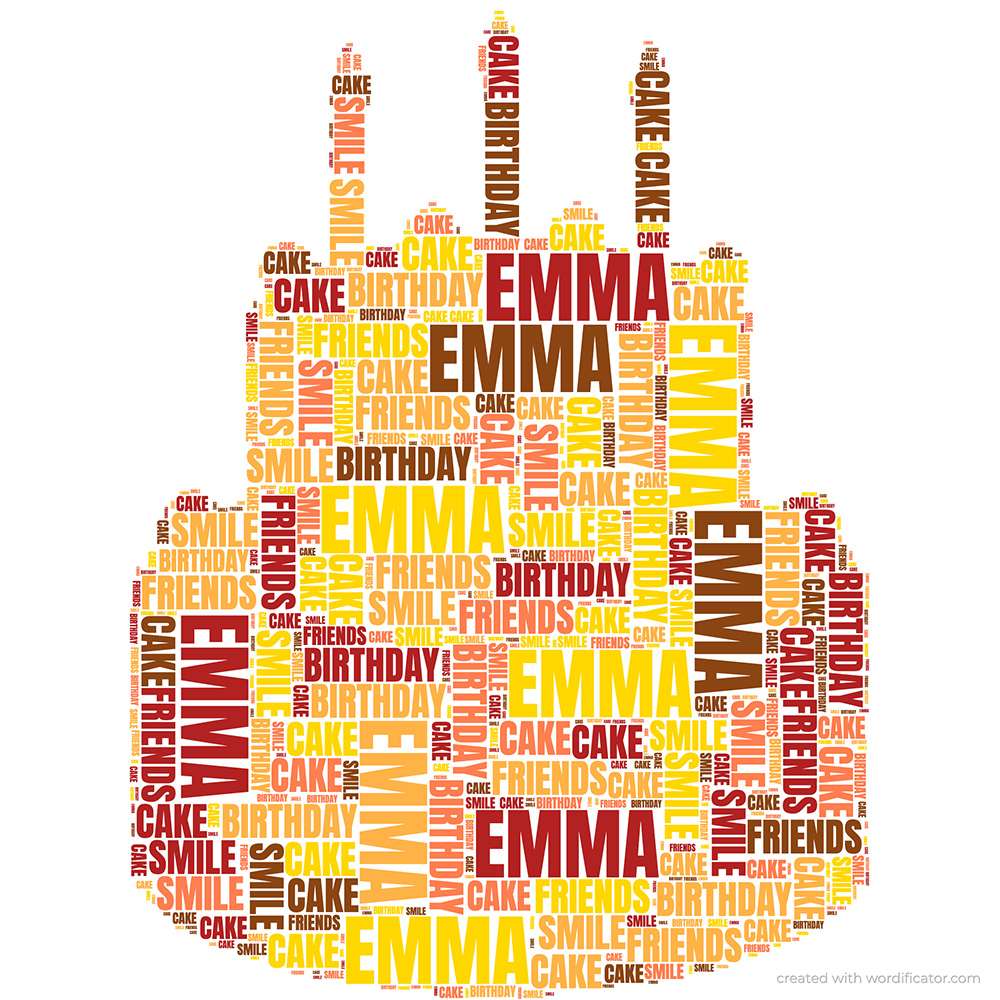
If you want a word to stand out from the other by appearing larger, you can add an asterisk (*) in front of it. This tells Wordificator to treat the word as more important and display it in a bigger font size.
For example:
In the left picture, “Emma” becomes the main highlight of the design. This technique can be used to give one or multiple key words extra emphasis.
Repeat important words
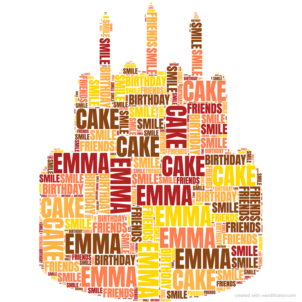
If you want a specific word to stand out without adding extra font size, simply repeat it in your list. A repeated word will be used more often and so becomes more prominent in the final layout.
For example:
In the left picture, “Emma” becomes the main highlight of the design. This technique can be used to give one or multiple key words extra emphasis.
Choose colors that match your theme
Colors have a huge impact on the mood of your design.
- For elegant results: use neutral or single-color palettes.
- For fun or children’s themes: use bright palettes.
- For professional designs: stick to 2–3 matching tones.
- For romantic shapes: warm reds, pinks, or gold-like tones work well.
High contrast between word color and background improves readability.
❤️ You can use emojis! 😀
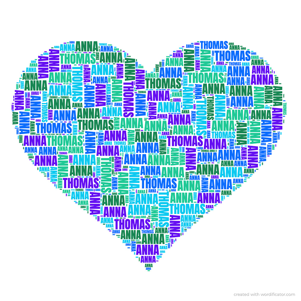
You can use emojis as text. If you work on a desktop PC you problably don't have emojis on your keyboard. Just google them or use a service like Emojipedia to copy/paste.
Some examples:
In the left picture, “Emma” becomes the main highlight of the design. This technique can be used to give one or multiple key words extra emphasis.
Experiment with font styles
Different fonts can completely change the personality of your artwork:
- Bold fonts for strong, modern designs.
- Sans-serif fonts for clean and minimal layouts.
- Handwritten fonts for warm and emotional designs.
- Narrow fonts to better fill detailed shapes.
Try generating the same word list with different fonts to see which style fits best.
If using own images, work with the Threshold slider
When uploading your own image, the Threshold slider controls which parts of the picture become part of the silhouette.
- Lower threshold values produce a simple, bold outline.
- Higher threshold values include more details from the image.
Move the slider until the preview shows a clear and balanced shape. Too high can make the shape chaotic, too low can remove important features.
Try multiple generations
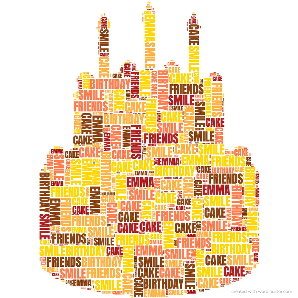
Each generation produces a slightly different, random arrangement. Just regenerate the image until you have your favourite result. You can restart the generation while the last one is still running. If you are searching for the “perfect version”, generate several times and pick your favorite result.
Download the image in 2048x2048px
Depending on your screen size the preview of the generated image my be just that - a preview. Do not forget to download the 2048x2048px PNG file. Higher pixel sizes allow you to:
- print posters,
- create framed artwork,
- design greeting cards,
- use your art in scrapbooks or photo books.
PNG is recommended for crisp edges and clean text. Higher resolutions will be possible soon.
Keep your shape simple if you want cleaner results
Very detailed shapes (for example animals with feathers, detailled portraits or complex logos) may require more words, more short words, a slightly lower threshold, and higher density. Simple shapes usually produce consistent results more easily.
Have fun and experiment
Each Wordificator generation run is mostly random and this mix is what gives each design its charm. Experiment with words, colors, fonts and shapes. Small modifications can lead to completely new artistic outcomes.
If you discover a trick that works especially well for you, feel free to share it or send me your ideas at contact@wordificator.com.
